Boilerplate Manual
Introduction
Boilerplate Manual จัดทำขึ้นเพื่อเป็นต้นแบบในการสร้างโปรเจคใหม่ได้รวดเร็วมากยิ่งขึ้น และโค้ดโปรเจคที่เกิดใหม่ไปในทิศทางเดียวกัน โดยทางทีมพัฒนาได้รวบรวมวิธีการใช้ การตั้งค่าต่างๆที่จำเป็น รวมไปถึงตัวอย่างBoilerplate ให้ผู้ที่พัฒนาสามารถนำโค้ดไปใช้งานเพื่อเป็นจุดเริ่มต้นในการพัฒนาโปรเจคได้
** ความสามารถที่มีมาให้ ประกอบด้วย **
-
Authentication and Authorization
- การ Login เข้าใช้งานระบบด้วย PSU Passport
- Basic User profile
- Logout
-
การตั้งค่า Theme ผ่าน Web browser
- Cookie consent
- UI ตัวอย่างการใช้งาน Ant Component เช่น Card, Tab, Table, Pagination
-
ตัวอย่างการทำ CRUD
- Entity Framework
- ฐานข้อมูล Oracle
-
การอัพโหลดไฟล์
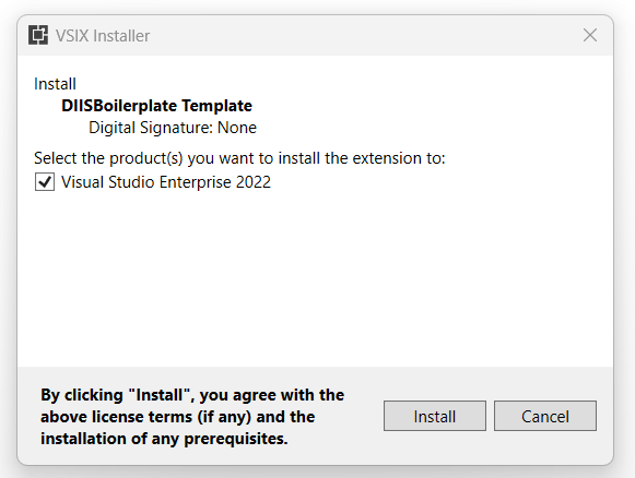
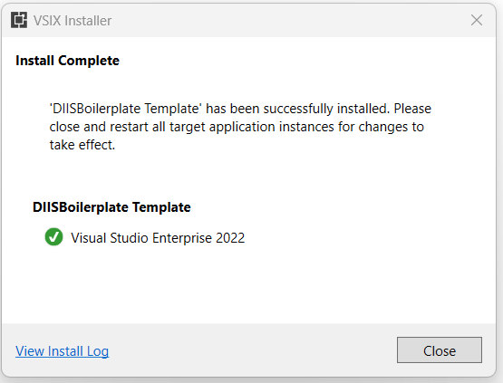
การติดตั้ง Boilerplate Template บน Visual Studio 2022
- ดาวน์โหลด boilerplate เวอร์ชั่นล่าสุด
- ติดตั้งโดยเปิดไฟล์ DIISBoilerplate_Template.vsix
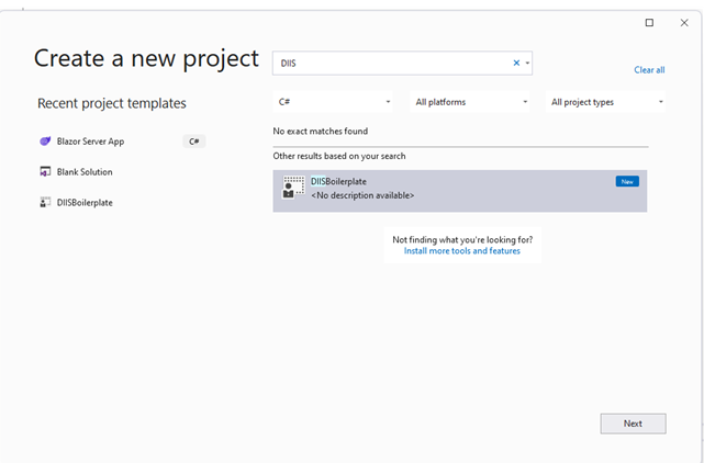
การสร้าง Project ใหม่จาก Boilerplate Template ด้วย Visual Studio 2022
-
คลิกเมนู File -> New -> Project
-
หน้าจอ Create a new project ให้พิมพ์ค้นหา Project Template ชื่อ DIISBoilerplate จากนั้นคลิกเลือก DIISBoilerplate และคลิก Next
-
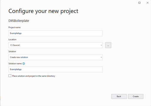
ตั้งชื่อ Project และระบุ Location บันทึก Source code จากนั้นคลิก Create
-
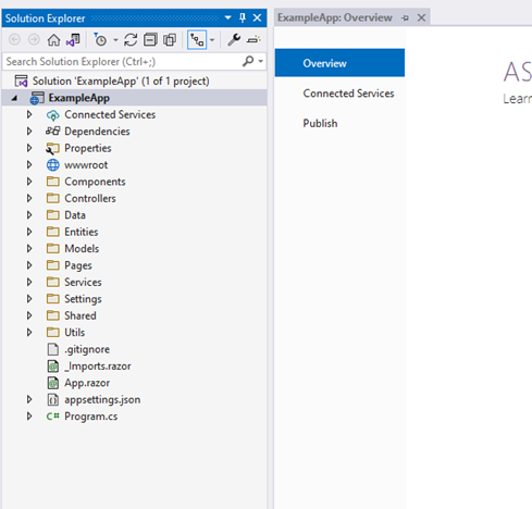
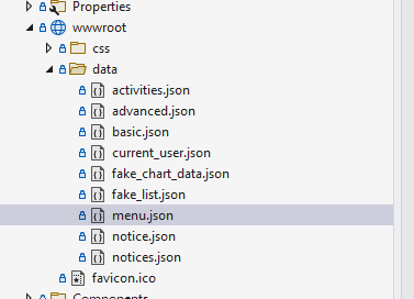
จะได้โปรเจคใหม่มีโครงสร้างดังรูป
Software Development Environment
Framework สำหรับการพัฒนา
-
ASP.NET Core Blazor Server*
-
.NET Core version 6
-
IDE: Visual Studio Code , Visual Studio 2022
Dependencies
-
AntDesign (0.12.7)
-
AntDesign.ProLayout (0.12.4)
-
IdentityModel (6.0.0)
-
Microsoft.EntityFrameworkCore.Tools (6.0.9)
-
Oracle.EntityFrameworkCore (6.21.61)
-
Newtonsoft.Json (13.0.1)
Configuration
Project Configuration
Project Configuration แบ่งตาม Environment ได้ 2 แบบคือ (1) Development Environment ทำการกำหนดค่าด้วยไฟล์ appsettings.Development.json และ (2) Production Environment ทำการกำหนดค่าด้วยไฟล์ appsettings.json
มีรายละเอียดดังนี้
appsettings.Development.json
{
  "DetailedErrors": true,
  "Logging":
  {
    "LogLevel":
    {
      "Default": "Information",
      "Microsoft.AspNetCore": "Warning"
    }
  },
  "ProSettings":
  {
    "NavTheme": "dark",
    "HeaderHeight": 48,
    "Layout": "side",
    "ContentWidth": "Fluid",
    "FixedHeader": false,
    "FixSiderbar": true,
    "Title": "ISD BoilerPlate",
    "IconfontUrl": null,
    "PrimaryColor": "cyan",
    "ColorWeak": false,
    "SplitMenus": false,
    "HeaderRender": true,
    "FooterRender": true,
    "MenuRender": true,
    "MenuHeaderRender": true
  },
  "OAuthSetting":
  {
    "OAuthBaseAddress": "https://oauth.psu.ac.th",
    "OAuthRedirectUri": "https://localhost:44381/callback/",
    "OAuthClientID": "xxxxxxxxx",
    "OAuthClientSecret": "xxxxxxxxx",
    "OAuthState": "xxxxxxxxx"
  },
  "FileUploadSetting":
  {
    "FilePathTemp": "\\Temp",
    "FileMaxSize": 10,
    "FilePathPrivate": "\\Upload\\\\Private",
    "FilePathPublic": "\\Upload\\\\Public"
  },
  "ConnectionStrings":
  {
    "DefaultConnection": "xxxxxxxxx"
  }
}
appsettings.json
{
    "DetailedErrors": true,
    "Logging":
    {
      "LogLevel":
        {
        "Default": "Information",
        "Microsoft.AspNetCore": "Warning"
        }
    },
    "ProSettings":
    {
      "NavTheme": "dark",
      "HeaderHeight": 48,
      "Layout": "side",
      "ContentWidth": "Fluid",
      "FixedHeader": false,
      "FixSiderbar": true,
      "Title": "ISD BoilerPlate",
      "IconfontUrl": null,
      "PrimaryColor": "cyan",
      "ColorWeak": false,
      "SplitMenus": false,
      "HeaderRender": true,
      "FooterRender": true,
      "MenuRender": true,
      "MenuHeaderRender": true
    },
    "OAuthSetting":
    {
      "OAuthBaseAddress": "https://oauth.psu.ac.th",
      "OAuthRedirectUri": "https://localhost:44381/callback/",
      "OAuthClientID": "xxxxxxxxx",
      "OAuthClientSecret": "xxxxxxxxx",
      "OAuthState": "xxxxxxxxx"
    },
    "FileUploadSetting":
    {
      "FilePathTemp": "\\Temp",
      "FileMaxSize": 10,
      "FilePathPrivate": "\\Upload\\\\Private",
      "FilePathPublic": "\\Upload\\\\Public"
    },
    "ConnectionStrings":
    {
      "DefaultConnection": "xxxxxxxxx"
    }
}
Authentication Configuration
การเชื่อมต่อ Service Authentication ต้องมีการตั้งค่าใน appsettings.json ดังนี้
"OAuthSetting":
{
  "OAuthBaseAddress": "https://oauth.psu.ac.th",
  "OAuthRedirectUri": "https://localhost:44381/callback/",
  "OAuthClientID": "xxxxxxxxx",
  "OAuthClientSecret": "xxxxxxxxx",
  "OAuthState": "xxxxxxxxx"
},
โดยค่าแต่ละ key มีความหมาย ดังนี้
1.OAuthBaseAddress - URL ของ Service Authentication
2.OAuthRedirectUri - Callback โดยค่าที่ใส่ จะเป็น hostname ของตัว Application ที่กำลังจะพัฒนา
3.OAuthClientID -- ID ได้จากตอนเพิ่ม application ใน Authentication Service
4.OAuthClientSecret -- รหัสผ่าน ได้จากตอนเพิ่ม Application ใน Authentication Service
5.OAuthState -- ค่าได้จากตอนเพิ่ม Application ใน Authentication Service
หมายเหตุ การเพิ่ม Application ใน Authentication Service ทำได้โดยการขอเพิ่มจากผู้ดูแลระบบ Authentication
Theme Configuration
กำหนดค่าด้วย ProSettings Section ในไฟล์ appsettings.json
ProSettings Section
"ProSettings":
{
  "NavTheme": "dark",
  "HeaderHeight": 48,
  "Layout": "side",
  "ContentWidth": "Fluid",
  "FixedHeader": false,
  "FixSiderbar": true,
  "Title": "ISD BoilerPlate",
  "IconfontUrl": null,
  "PrimaryColor": "cyan",
  "ColorWeak": false,
  "SplitMenus": false,
  "HeaderRender": true,
  "FooterRender": true,
  "MenuRender": true,
  "MenuHeaderRender": true
}
การใช้เครื่องมือตั้งค่า Theme
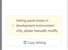
1.คลิกปุ่มตั้งค่า  ระบบจะเปิดหน้าจอ Page style settings
2.กำหนดค่าต่าง ๆ เช่น ตำแหน่งเมนู Theme สีหลักของระบบ เป็นต้น
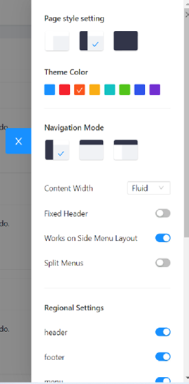
3.หลังจากปรับ Theme ตามที่ต้องการแล้วให้คลิกปุ่ม Copy Settings จะได้ค่าของ ProSettings Section ให้นำไปวางไว้ในไฟล์ appsettings.json
Menu Configuration
กำหนดค่าเมนูด้วยไฟล์ menu.json
menu.json
[
  {
    "path": "/",
    "name": "Home",
    "key": "home",
    "icon": "home"
  },
  {
    "path": "/search",
    "name": "Search",
    "key": "search",
    "icon": "search"
  },
  {
    "path": "/Example/UploadSample",
    "name": "Upload",
    "key": "Upload",
    "icon": "Upload"
  },
  {
    "path": "/Example",
    "name": "exampleChild",
    "key": "exampleChild",
    "icon": "Upload"
    "children":
    [
      {
        "path": "/child1",
        "name": "child1",
        "key": "child1"
      },
      {
        "path": "/child2",
        "name": "child2",
        "key": "child2"
      }
    ]
  }
]
การตั้งค่า menu สามารถกำหนดได้โดยค่าใน Array ของ menu.json โดยจะมี object ที่มี key ดังนี้
path, name, key และ icon
ในกรณีที่มี submenu ย่อยในเมนูหลักนั้นๆ จะมีการกำหนด key ที่มีชื่อเพิ่มว่า children ส่งค่า array ที่เป็น array ของ object ที่มี key ดังนี้ path, name และ key ดังตัวอย่างข้างบน จะเห็นได้ว่า เมนูที่ชื่อว่า exampleChild จะมี submenu ย่อย 2 เมนูคือ child1 และ child2
Ant Design Components
คำแนะนำการใช้ Ant Design Component ร่วมกับการพัฒนาระบบจาก Boilerplate
Card
| คู่มือการใช้งาน | https://antblazor.com/en-US/components/card |
| คำแนะนำการใช้งาน |
- ใช้สำหรับจัดรูปแบบเค้าโครงระบบ (Layout) - ใช้สำหรับแสดงผลข้อมูลที่มีปริมาณไม่มากและต้องการความสวยงาม - ไม่แนะนำสำหรับ Content ที่มีปริมาณมากแนะนำให้ใช้ Table แทน |
Table
| คู่มือการใช้งาน | https://antblazor.com/en-US/components/table |
| คำแนะนำการใช้งาน |
- ใช้สำหรับแสดงผลข้อมูล จากฐานข้อมูลที่มีจำนวนมาก - มีส่วนการกรองข้อมูล (Filter) และการจัดเรียงข้อมูล (Sort) ให้ใช้งาน - ถ้าข้อมูลมีปริมาณมากควรใช้ pagination แบ่งหน้าข้อมูล - แต่ถ้าความต้องการของลูกค้าต้องการให้แสดงผลข้อมูลหน้าแรกเพียงหน้าเดียวแนะนำให้ใช้วิธีการ Lazy loading - กรณีต้องการแสดงผลข้อมูลในรูปแบบการจัดกลุ่มข้อมูล (Group) แนะนำให้ใช้ Nested Table - สามารถนำ Component อื่น ๆ ที่ต้องการใช้งานมาใส่ใน Table ได้ เช่น Radio Button, Tags, List เป็นต้น |
Empty
| คู่มือการใช้งาน | https://antblazor.com/en-US/components/empty |
| คำแนะนำการใช้งาน | ใช้ร่วมกับ data binding Components เช่น Table, List ในกรณีที่ไม่มีข้อมูลแสดงหรือ จำนวน records เป็น 0 |
DatePicker
| คู่มือการใช้งาน | https://antblazor.com/en-US/components/datepicker |
| คำแนะนำการใช้งาน |
- ใช้สำหรับการระบุข้อมูลที่อยู่ในรูปแบบวันที่ หรือการแสดงผลในรูปแบบวันที่ - สามารถ Config Locale ได้ ค่าตั้งต้น (Default) ขึ้นอยู่กับการตั้งค่าภาษาของเครื่อง |
Modal
| คู่มือการใช้งาน | https://antblazor.com/en-US/components/modal |
| คำแนะนำการใช้งาน |
- กรณีเป็นการจัดการข้อมูลสำคัญ แนะนำให้เลือกใช้ Confirmation modal dialog เนื่องจากสามารถแสดงรายละเอียดได้ - กรณีเป็นการจัดการข้อมูล แนะนำให้เลือกใช้ popconfirm แทน - ใช้สำหรับแจ้งเตือนเรื่องสำคัญ - ไม่แนะนำให้ใช้ Modal ซ้อนกัน |
Notification
| คู่มือการใช้งาน | https://antblazor.com/en-US/components/notification |
| คำแนะนำการใช้งาน |
- ใช้สำหรับการแสดงข้อความเป็นการแจ้งเตือนโดยมีหลากหลาย position ให้เลือกจัดวาง - กรณีแสดงข้อความแจ้งเตือนสำคัญ แนะนำให้ใช้ Modal |
Spin
| คู่มือการใช้งาน | https://antblazor.com/en-US/components/spin |
| คำแนะนำการใช้งาน | ใช้สำหรับขั้นตอนระหว่างรอโหลด/เปิดเอกสาร หรือระหว่างเปลี่ยนหน้าที่ต้องใช้ระยะเวลา |
Skeleton
| คู่มือการใช้งาน | https://antblazor.com/en-US/components/skeleton |
| คำแนะนำการใช้งาน | ใช้สำหรับขั้นตอนระหว่างรอโหลดข้อมูล/ข้อความ เช่น ข้อความที่เป็น paragraph |
DIIS Components
Upload
สามารถกำหนดค่าคอนฟิกต่างๆ ได้ในไฟล์ appsettings.json โดยกำหนดใน section FileUploadSetting ดังนี้
-
"FilePathTemp" กำหนด Path เก็บไฟล์อัปโหลดชั่วคราว
-
"FileMaxSize" กำหนดขนาดไฟล์สูงสุด หน่วยเป็น MB
-
"FilePathPrivate" กำหนด Path เก็บไฟล์
-
"FilePathPublic" กำหนด Path เก็บไฟล์
ตัวอย่าง
"FilePathTemp": "\\Temp",
"FileMaxSize": "10",
"FilePathPrivate": "\\Upload\\Private",
"FilePathPublic": "\\Upload\\Public"
วิธีการนำ Upload Component ไปใช้งาน
1) กำหนดประเภทของไฟล์สำหรับนำไปใช้ในการตรวจสอบ เช่น .doc, .docx และ .pdf เป็นต้น
2) กำหนดจำนวนไฟล์ที่สามารถอัปโหลดได้ เช่น 3 ไฟล์ เป็นต้น
ตัวอย่าง Source Code สำหรับนำไปใช้งาน
@page "/Example/UploadSample"

<UploadFilesComponent @ref="uploadFilesComponent2" FileTypes="fileTypes" MaxAllowedFiles="3"></UploadFilesComponent>

@code {
    List<string> fileTypes = new List<string>() { ".jpeg", ".jpg", ".png", ".pdf" };
}
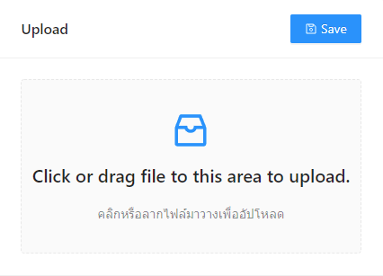
ตัวอย่าง UI Upload component
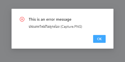
ตัวอย่าง กรณีอัปโหลดไฟล์ไม่ถูกต้องตามประเภทไฟล์ที่ระบุ
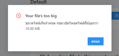
ตัวอย่าง กรณีอัปโหลดไฟล์ขนาดไฟล์เกินกำหนดที่ระบุ
ตัวอย่าง กรณีอัปโหลดไฟล์มากกว่า 3 ไฟล์ขึ้นไป

ตัวอย่าง กรณีอัปโหลดไฟล์ถูกต้อง (กรณีไม่กดปุ่ม Save)
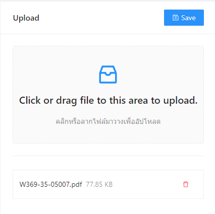
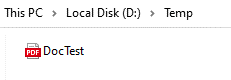
หมายเหตุ:ไฟล์จะถูกจัดเก็บในโฟลเดอร์ที่ถูกตั้งค่าใน appsettings.json (FilePathTemp) ในกรณีนี้คือ โฟลเดอร์ Temp
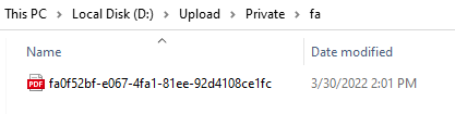
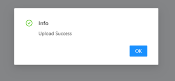
ตัวอย่าง กรณีอัปโหลดไฟล์ถูกต้อง (กรณีกดปุ่ม Save) จะขึ้นข้อความดังนี้
หมายเหตุ:
1) ไฟล์จะถูกจัดเก็บในโฟลเดอร์ที่ถูกตั้งค่าใน appsettings.json (FilePathPrivate) ในกรณีนี้คือ โฟลเดอร์ Upload/Private
2) ไฟล์ที่ถูกอัปโหลดจะอยู่ในโฟลเดอร์ตามชื่อไฟล์ (2 ตัวอักษรแรก)